Design Tokens
Overview
Design tokens are named variables that store design decisions, acting as the "source of truth" for all color decisions within our products. Instead of using #FFFFFF to set the color of a header everywhere, you'd use text-strong. The token name stays the same, but the actual color can change based on theme, platform, or updates to the design system.
Think of tokens as a shared language between designers and engineers. When a designer hands off a screen using background-base-low, engineers know to use that in code. No guessing the color, no misalignments.

Why use tokens?
- Consistency: Everyone uses the same colors, spacing, and styles across all platforms
- Flexibility: Change a color once and it updates everywhere that token is used
- Themes: Tokens automatically adapt to our base themes, preset themes, and custom gradient themes.
- Clarity: Names like
text-defaulttell you what something is for, not just what it looks like
Contract of intent
When you use a token, you're choosing intent, not appearance.
If you use background-base-lowest, you're saying "I need the primary app background" — not "I need the darkest shade of grey." The actual color might be different in light mode, or on mobile, or in a future update. That's intentional.
Tokens let your designs and code adapt to our visual language rather than locking in specific values that might change.
Token Types
Teardrop has four layers of tokens. Each layer builds on the one before it, adding more meaning and context.
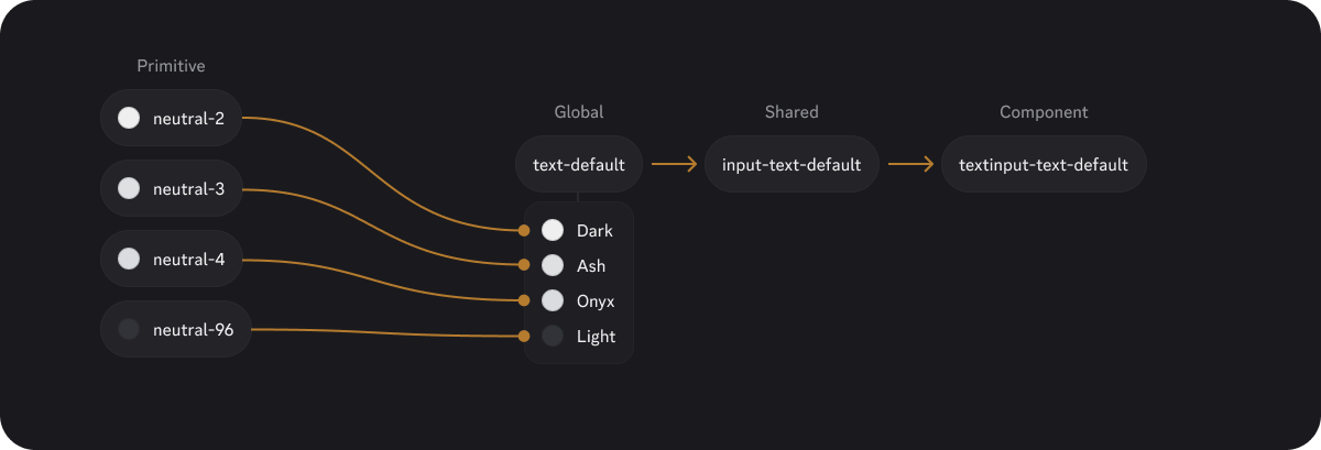
Primitive tokens
Primitive tokens are direct aliases to raw values: colors, type, spacing and more. They don't have any semantic meaning on their own — they're just the building blocks.
Examples:
neutral-66
blurple-50
spacing-4
opacity-red-64
Who uses them: Mostly Design Systems. These aren't exposed in Figma or available to product teams.
Global tokens
Global tokens define the foundational visual styles: backgrounds, text, borders, and icons. They establish the base look and feel of our products.
Examples:
background-base-low
text-strong
border-subtle
icon-muted
radius-sm
Who uses them: Everyone. These are the tokens you'll use most often when building layouts and applying foundational styles.
Shared tokens
Shared tokens define how things behave across states — hover, active, focus, disabled, and more. They're reusable patterns that multiple components can reference.
Examples:
control-primary-background-default
control-secondary-background-hover
control-critical-primary-border-focus
input-border-focus
Who uses them: Product teams building beyond Teardrop's component library—whether that's custom feature components or page layouts.
Component tokens
Component tokens tie shared patterns to specific UI elements like buttons, radios, and inputs. They're usually just aliases that point to shared tokens.
Examples:
button-primary-background-hover
radio-background-selected-default
checkbox-thumb-background-active
Who uses them: Mostly Design Systems. These power Teardrop components internally and aren't exposed to product teams.
Token Grammar
Every token follows a consistent naming structure. The name tells you what it is, where it belongs, and what it does.
For Primitive and Global tokens

Example: text-feedback-critical
- category: text
- sub-category: feedback (the type of text)
- item: critical (the type of severity)
For Shared and Component tokens
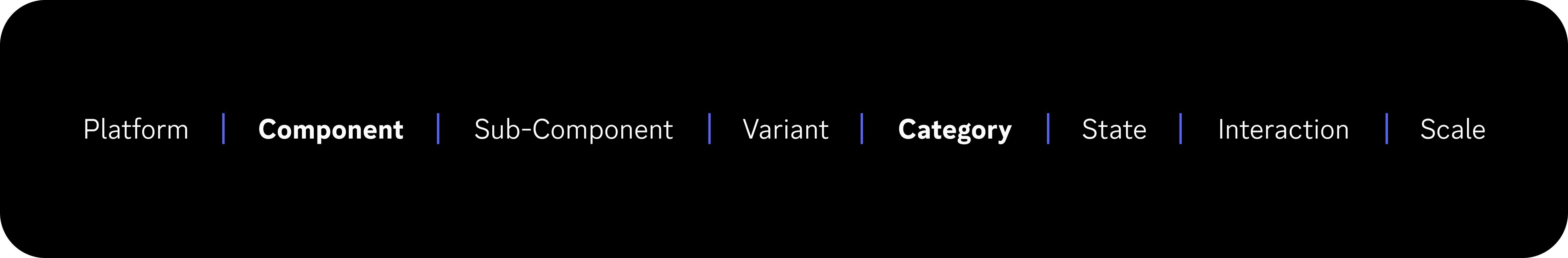
Example: control-critical-border-selected-focus
- component: control (a shared pattern)
- variant: critical (error state styling)
- category: border
- state: selected
- interaction: focus
The building blocks
| Segment | Example | Description | Usage | Required |
|---|---|---|---|---|
| Platform | mobile- | Only used if a token differs by platform. | Any | No |
| Component | button, radio, input, tooltip, interactive | Defines where the token applies or groups behavioral patterns. | Shared, Component | Yes |
| Sub-Component | thumb, track | Identifies specific parts within a component. | Shared, Component | No |
| Variant | primary, secondary, tertiary, critical, positive, etc. | Describes the visual tone or intent. | Shared, Component | Conditional ✝︎ |
| Category | background, foreground, text, border, icon, shadow | Describes the visual property the token applies to. | Any | Yes |
| Sub-Category | base, surface, feedback, overlay, etc. | An additional layer of the category. Refers to function or surface type. | Global | No |
| Item | lower, lowest, higher, highest, light, dark | Describes hierarchy or intensity level. | Global | No |
| State | error, loading, readonly, disabled, selected, etc. | Semantic state — typically matches a component prop. | Shared, Component | No |
| Interaction | default, hover, active, focused | Describes interaction condition. | Shared, Component | No |
| Scale | sm, md, lg, faint, subtle, fast, slow | For scale variations. | Any | No |
✝︎ Required when the element has multiple visual styles (e.g., button has primary/secondary). Omit when there's only one style (e.g., radio, checkbox have no variants).
Not sure if a new token is needed?
The goal is to make sure every token earns its place in the system. We're here to help! Reach out to the Design Systems team for guidance.